

Ensure your Shopify store is mobile-friendly by using responsive design and optimizing images. Simplify navigation and improve loading speed.
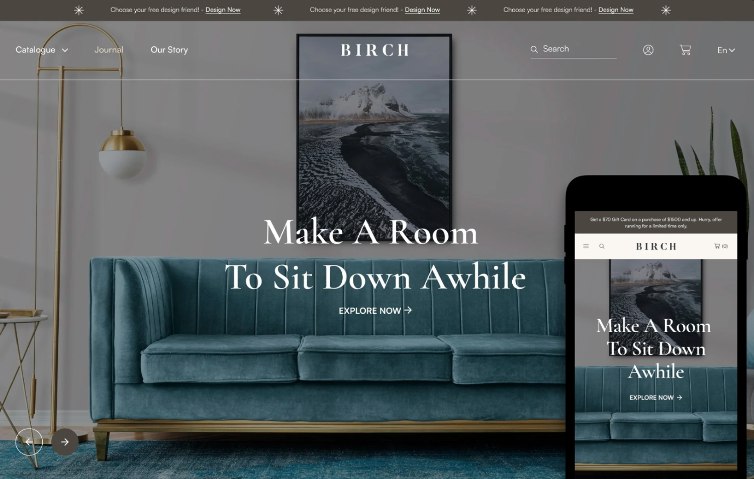
Mobile users form a significant portion of online shoppers today. A mobile-friendly Shopify store can enhance user experience and boost sales. Responsive design ensures your site adapts to various screen sizes seamlessly. Optimizing images can reduce loading times, making your store faster and more efficient.
Simplified navigation allows users to find products quickly, improving overall satisfaction. Implementing these design tips can lead to higher engagement and conversion rates. Prioritizing mobile optimization is essential for staying competitive in the e-commerce market. Focus on creating a smooth, enjoyable browsing experience for mobile users to maximize your store’s potential.
Importance Of Mobile-friendly Design
In the digital world, having a mobile-friendly Shopify store is crucial. Most shoppers use smartphones to browse and buy products online. A mobile-friendly design ensures that your store looks great and works well on all devices. This boosts user engagement and increases sales.
User Experience
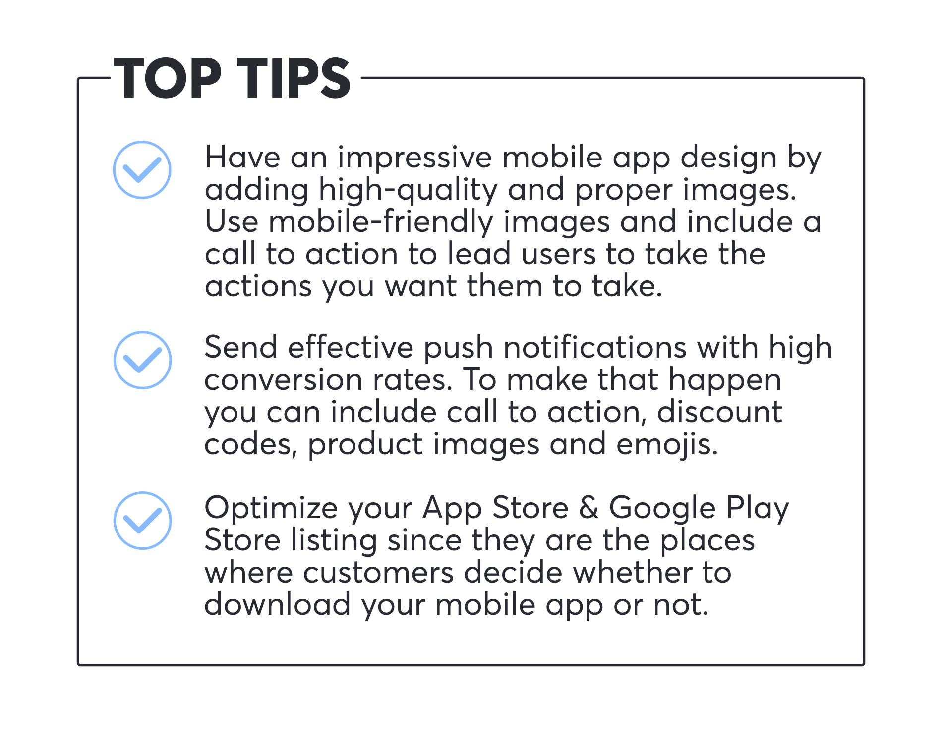
A mobile-friendly design enhances the user experience. Shoppers can easily navigate your store on their phones. This means faster load times and easy-to-read text. It also means that buttons and links are easy to click. This keeps users happy and reduces bounce rates. Here are some tips to improve user experience:
- Use responsive design.
- Optimize images for faster loading.
- Use large, readable fonts.
- Ensure touch-friendly navigation.
Seo Benefits
Google favors mobile-friendly websites in search results. This means a mobile-friendly Shopify store can improve your SEO rankings. Higher rankings bring more organic traffic to your store. Here are some SEO benefits of a mobile-friendly design:
| Benefit | Description |
|---|---|
| Improved Rankings | Google ranks mobile-friendly sites higher. |
| Increased Traffic | Higher rankings lead to more visitors. |
| Better User Engagement | Users spend more time on mobile-friendly sites. |
Follow these steps to optimize your store for SEO:
- Use a mobile-responsive theme.
- Optimize images for faster loading.
- Use descriptive alt text for images.
- Ensure fast page load speeds.
Responsive Themes
Having a mobile-friendly Shopify store is essential. Responsive themes adapt to different screen sizes. They enhance user experience on smartphones and tablets.
Choosing The Right Theme
Choosing the right theme is crucial for your store. Look for themes that are fully responsive. Check if the theme looks good on various devices. You can use Shopify’s theme store to find options. Read reviews and see how the theme performs on mobile.
Here are some key points to consider:
- Responsive design
- Fast loading speed
- Customizable layout
- Good reviews and ratings
Customizing Themes
After selecting a theme, customization is the next step. Tailor the theme to fit your brand. Make sure all elements are mobile-friendly. Test your changes on different devices.
Consider these tips for customization:
- Use large, readable fonts
- Optimize images for faster loading
- Ensure buttons are easy to tap
- Remove unnecessary content
Customizing your theme helps in creating a seamless user experience. This improves customer satisfaction and increases sales.
Mobile-optimized Images
Optimizing your Shopify store for mobile users is crucial. Mobile users demand fast-loading and visually appealing sites. One key aspect to consider is mobile-optimized images. Properly optimized images can enhance user experience and improve your store’s performance. Let’s dive into some essential tips.
Image Compression
Image compression reduces file sizes without losing quality. Smaller files load faster, which is vital for mobile users. Use tools like TinyPNG or ImageOptim to compress your images.
Follow these steps to compress your images:
- Upload your image to the compression tool.
- Adjust the compression settings, if needed.
- Download the compressed image.
Save the compressed image with a clear file name. This helps with SEO and organization.
Appropriate Image Sizes
Using the right image size is crucial. Oversized images slow down your site. Determine the appropriate size for your Shopify store. Common sizes include:
| Image Type | Recommended Size |
|---|---|
| Product Images | 800 x 800 pixels |
| Banner Images | 1200 x 600 pixels |
| Thumbnail Images | 150 x 150 pixels |
Always use responsive images. This ensures images adjust to different screen sizes. Include srcset in your HTML code to define multiple sizes:


This technique ensures the browser chooses the best image size for the device.

Simplified Navigation
Creating a mobile-friendly Shopify store is essential. Simplified navigation helps users find products easily. This section covers key design tips for better navigation.
Menu Design
A well-designed menu is crucial for mobile navigation. Use a hamburger menu to save space. This icon usually has three horizontal lines. It hides the menu until clicked.
Organize your menu items logically. Group similar items together. For example:
- Home
- Shop
- Men
- Women
- Kids
- About Us
- Contact
Keep the number of menu items minimal. Too many options can overwhelm users. Prioritize the most important sections. This ensures quick access to key pages.
Search Functionality
A search bar is vital for mobile navigation. Place it at the top of the page. This makes it easy to find.
Ensure the search bar is easy to use. It should have a large enough touch area. Users should be able to type without issues.
Implement auto-suggestions. This helps users find products faster. For example:
| Typed Text | Auto-Suggestion |
|---|---|
| Sh | Shoes |
| Shirt | Shirts |
Include a filter option in the search results. This allows users to narrow down their search. Filters can include price range, size, color, and more.
Ensure your search function is fast. Slow search results can frustrate users.
Touch-friendly Elements
Ensuring your Shopify store is mobile-friendly is crucial. One key aspect is touch-friendly elements. These are essential for enhancing user experience on mobile devices. They make navigation easy and interactions smooth.
Button Size And Spacing
Buttons should be easy to tap on mobile devices. Ensure they are large enough for fingers. A good size is at least 44×44 pixels. This size reduces the chance of accidental taps.
Spacing between buttons is also important. Make sure there is enough space to avoid mis-taps. A gap of at least 10 pixels is recommended. This ensures users do not press the wrong button.
Interactive Elements
Interactive elements like links and menus should be easy to use. Make sure they respond well to touch. Links should have a minimum height of 44 pixels. This makes them easy to tap.
Menus should be simple and intuitive. Use drop-down menus sparingly. Ensure they are easy to close. Avoid placing too many links close together. This prevents user frustration.
Also, consider using touch gestures for navigation. Swiping and tapping can enhance user experience. These gestures make your site feel more like a native app.
Fast Loading Times
Fast loading times are crucial for a mobile-friendly Shopify store. Users expect instant access to your content. Slow pages drive users away and harm your SEO ranking. Focus on minimizing code and using caching techniques to ensure speedy load times.
Minimizing Code
Minimize your website’s code to enhance loading speeds. Remove unnecessary characters, white spaces, and comments from HTML, CSS, and JavaScript files. Use tools like HTML Minifier, CSSNano, and UglifyJS.
Consider using a content delivery network (CDN). CDNs store copies of your site on multiple servers around the world. This reduces the distance data travels, speeding up load times.
Optimize your images by compressing them. Use formats like JPEG and PNG. Tools like TinyPNG and ImageOptim can help.
Caching Techniques
Implement caching to store frequently accessed data. This reduces the time needed to load pages. Shopify supports browser caching. Adjust the cache settings in your store’s theme.
Use server-side caching. This stores a version of your site on the server. Visitors get a pre-loaded version of your site, which loads faster.
Leverage client-side caching. This stores a version of your site on the user’s device. Returning visitors experience faster load times.
| Optimization Technique | Description | Tool/Service |
|---|---|---|
| Minimizing Code | Remove unnecessary characters and spaces | HTML Minifier, CSSNano, UglifyJS |
| CDN | Store copies of site globally | Cloudflare, AWS CloudFront |
| Image Optimization | Compress images to reduce size | TinyPNG, ImageOptim |
| Browser Caching | Store data in user’s browser | Shopify settings |
| Server-Side Caching | Store a version on the server | Shopify settings |
| Client-Side Caching | Store data on user’s device | Shopify settings |
Mobile Checkout Optimization
Optimizing the mobile checkout process is crucial for Shopify stores. A smooth checkout experience increases conversion rates and reduces cart abandonment. This section highlights key tips for mobile checkout optimization.
Streamlined Forms
Streamlined forms are essential for a quick and easy checkout. Simplify the fields to only the necessary ones. Avoid asking for redundant information.
- Use autofill to speed up the process.
- Make sure the form fields are large enough.
- Label each field clearly.
Consider using a single-page checkout to reduce steps. A single-page checkout keeps users on one screen, reducing friction.
Payment Gateways
Offer multiple payment gateways to cater to different preferences. Popular options include:
- PayPal
- Apple Pay
- Google Pay
- Credit/Debit Cards
Ensure the payment gateways are mobile-friendly. They should load quickly and be easy to use on small screens.
Use secure payment options to build trust. Display security badges and SSL certificates to reassure customers.
Here’s a summary of the essential tips for mobile checkout optimization:
| Tip | Description |
|---|---|
| Streamlined Forms | Simplify fields, use autofill, and clear labels. |
| Single-Page Checkout | Reduce steps by keeping users on one screen. |
| Payment Gateways | Offer multiple and mobile-friendly options. |
| Secure Payments | Use secure options and display security badges. |
Testing And Feedback
Ensuring your Shopify store is mobile-friendly is crucial. Testing and feedback are key steps in achieving this. By focusing on usability testing and collecting customer feedback, you can refine your store’s mobile experience.
Usability Testing
Usability testing helps identify issues in your store’s design. Test with real users on various mobile devices.
- Set up test scenarios for users to complete.
- Observe how users navigate your store.
- Note any difficulties they encounter.
Use tools like Google Analytics and Heatmaps to gather data. Analyze user behavior to spot trends and areas for improvement.
Customer Feedback
Gathering customer feedback is vital. It provides insights into the user experience.
- Send out surveys to your customers.
- Ask specific questions about mobile usability.
- Encourage honest opinions on what works and what doesn’t.
Utilize customer reviews and ratings. Positive feedback highlights strengths, while negative comments show areas to enhance.
Implement changes based on feedback. Regular updates keep your store user-friendly and engaging.
Frequently Asked Questions
How To Make Shopify Store Mobile-friendly?
To make your Shopify store mobile-friendly, use a responsive theme. Optimize images, simplify navigation, and ensure fast loading times. Test your store on different devices.
Why Is Mobile-friendly Design Important For Shopify?
Mobile-friendly design is crucial as most users shop via smartphones. It improves user experience, increases engagement, and boosts sales. Google also ranks mobile-friendly sites higher.
What Are The Best Mobile-friendly Shopify Themes?
Popular mobile-friendly Shopify themes include Debut, Brooklyn, and Minimal. These themes are responsive, easy to customize, and offer excellent user experience across devices.
How To Optimize Images For Mobile Shopify Store?
Optimize images by compressing them without losing quality. Use formats like JPEG or WebP. Avoid large image files to ensure faster loading times on mobile devices.
Conclusion
Making your Shopify store mobile-friendly boosts user experience and sales. Implement responsive design and fast loading times. Simplify navigation and optimize images. Test your site on various devices. Following these tips ensures a seamless shopping experience. Start improving your store today to capture more mobile customers.