

Responsive WordPress website design ensures your site looks great on all devices. It improves user experience and boosts SEO rankings.
Creating a responsive WordPress website is essential in today’s mobile-first world. Many users access websites on smartphones and tablets, so your site must adapt to different screen sizes. A responsive design automatically adjusts elements like images, text, and navigation to fit various devices.
This approach not only enhances user satisfaction but also improves your site’s search engine ranking. WordPress offers numerous themes and plugins that simplify building a responsive site. By choosing the right tools and following best practices, you can create a seamless experience for all users. Start optimizing your WordPress site for responsiveness today to stay ahead in the digital landscape.
Introduction To Responsive Design
Responsive design is crucial for modern websites. It ensures your site looks good on all devices. This guide will help beginners understand its basics.
What Is Responsive Design?
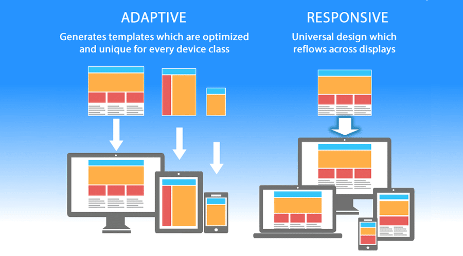
Responsive design is a web design approach. It makes web pages render well on various devices. This includes desktops, tablets, and mobile phones.
To achieve this, developers use flexible grids and layouts. They also use images and CSS media queries. Responsive design adapts the content based on screen size and orientation.
Importance In Modern Websites
Modern websites must be user-friendly on all devices. Many users browse the internet on their phones. If a site isn’t mobile-friendly, users may leave.
Search engines like Google prefer responsive sites. They rank them higher in search results. This makes responsive design essential for SEO.
Responsive design also improves user experience. It ensures the site is easy to navigate. Users can find what they need quickly.
| Benefits | Description |
|---|---|
| Better User Experience | Users can easily navigate your site on any device. |
| Higher SEO Rankings | Responsive sites rank better on search engines. |
| Increased Mobile Traffic | More users will visit your site on their phones. |
| Cost-Efficiency | One site works for all devices, saving development costs. |
- Use flexible grids and layouts
- Implement CSS media queries
- Optimize images for different screen sizes
- Understand your audience’s device usage.
- Test your site on various devices.
- Regularly update your design for new devices.
Choosing The Right Theme
Choosing the right theme is crucial for your WordPress website. A good theme enhances user experience and boosts SEO rankings. It must be responsive and visually appealing. Let’s explore how to make the best choice.
Responsive Vs. Non-responsive Themes
A responsive theme adjusts to different screen sizes. This means your site looks great on desktops, tablets, and smartphones. A non-responsive theme does not adjust. Users may have a poor experience on smaller devices.
Google prefers responsive themes. They improve mobile usability and SEO rankings. Most modern themes are responsive. Always check before installing.
Top Responsive Themes For Beginners
Here are some top responsive themes perfect for beginners:
| Theme Name | Features | Rating |
|---|---|---|
| Astra | Lightweight, customizable, SEO-friendly | ⭐⭐⭐⭐⭐ |
| OceanWP | Fast, multipurpose, eCommerce-ready | ⭐⭐⭐⭐⭐ |
| Neve | Speed optimized, flexible design, AMP compatible | ⭐⭐⭐⭐⭐ |
These themes offer many benefits:
- Astra: Highly customizable, perfect for any site.
- OceanWP: Great for online stores and blogs.
- Neve: Ideal for speed and mobile readiness.
Each theme is easy to use. They come with built-in tutorials and support. Choose one that fits your site’s needs. Experiment and see which works best.
Essential Plugins
Creating a responsive WordPress website starts with choosing the right plugins. These plugins ensure your site looks great on all devices. They optimize design, enhance user experience, and boost performance.
Must-have Plugins For Responsiveness
To make your WordPress site responsive, use these essential plugins:
- WP Touch: Automatically creates a mobile-friendly version of your site.
- Jetpack: Offers a variety of features, including mobile theme support.
- Elementor: A drag-and-drop page builder with responsive design options.
- Smush: Compresses images for faster load times on mobile devices.
- WP Super Cache: Improves site speed by caching pages.
How To Install And Configure Plugins
Follow these steps to install and configure your plugins:
- Log in: Access your WordPress dashboard.
- Navigate: Go to
Plugins > Add New. - Search: Type the plugin name in the search bar.
- Install: Click Install Now.
- Activate: Click Activate to enable the plugin.
- Configure: Go to
Settingsto adjust plugin options.
| Plugin | Configuration Tips |
|---|---|
| WP Touch | Enable mobile theme and customize settings. |
| Jetpack | Activate mobile theme and optimize features. |
| Elementor | Use responsive design tools within the editor. |
| Smush | Configure image compression levels for best results. |
| WP Super Cache | Enable caching and set up advanced options. |
These plugins make your WordPress site look perfect on all devices. They ensure faster loading times and a better user experience.
Mobile-friendly Navigation
Mobile-friendly navigation is crucial for a responsive WordPress website. It ensures users can easily find what they need on any device. A well-designed mobile navigation improves user experience and boosts engagement.
Creating Responsive Menus
Responsive menus adjust to different screen sizes. They make it easy for users to navigate your site on mobile devices.
- Use a mobile-first approach: Design the menu for small screens first, then expand it for larger screens.
- Implement a hamburger menu: This icon saves space and is familiar to users.
- Utilize dropdown menus: They keep the interface clean and organized.
Here is a simple code example for a responsive menu:
Best Practices For Mobile Navigation
Follow these best practices to create effective mobile navigation:
- Keep it simple: Avoid clutter. Use only essential menu items.
- Ensure readability: Use large, readable fonts. Maintain good contrast.
- Test on multiple devices: Ensure your menu works well on various screen sizes.
- Use touch-friendly elements: Make buttons and links easy to tap.
These best practices help users navigate your site easily. A good mobile menu enhances user experience and keeps visitors on your site longer.
Optimizing Images And Media
Optimizing images and media is essential for a responsive WordPress website. It ensures fast load times and a better user experience. This section covers key techniques for optimizing images and media.
Responsive Image Techniques
Responsive images adapt to different screen sizes. This improves website performance. Here are some techniques:
- Use the
- Use the
srcsetattribute: This defines multiple image sources for different resolutions. - Compress images: Use tools like TinyPNG or JPEG-Optimizer to reduce file sizes.
- Lazy loading: Load images only when they come into the viewport.
Using Media Queries Effectively
Media queries help create responsive designs. They apply styles based on device characteristics. Below are some tips:
- Breakpoints: Set breakpoints for different screen sizes like mobile, tablet, and desktop.
- Fluid Grids: Use percentage-based widths for layout elements.
- Viewport Meta Tag: Add
to your HTML. - Font Sizes: Use relative units like ems or rems for font sizes.
| Technique | Description |
|---|---|
Use the | Allows for different images based on screen size |
Use the srcset attribute | Defines multiple image sources for different resolutions |
| Compress images | Reduces file sizes for faster load times |
| Lazy loading | Loads images only when they are needed |
Implement these techniques to optimize images and media. It will enhance user experience and boost website performance.
Testing Your Website
After designing your responsive WordPress website, it’s crucial to test it. Testing ensures your site looks great on all devices. This step guarantees a seamless user experience across different screen sizes.
Tools For Responsiveness Testing
Several tools help you test your website’s responsiveness:
- Google Mobile-Friendly Test: Checks if your site is mobile-friendly.
- BrowserStack: Allows testing on real devices and browsers.
- Responsinator: Shows how your site looks on popular devices.
- Viewport Resizer: A browser extension to test various screen sizes.
Using these tools, you can identify any design flaws. This helps you ensure a consistent look across devices.
Common Issues And Fixes
While testing, you might find some common issues. Here are a few and how to fix them:
| Issue | Fix |
|---|---|
| Images not scaling | Use max-width: 100% in your CSS. |
| Text too small | Set a readable font size, like 16px. |
| Elements overlapping | Use proper padding and margin. |
| Navigation issues | Implement a mobile-friendly menu, like a hamburger menu. |
Addressing these issues ensures a better user experience. Keep testing and tweaking until your site is perfect.
Performance Optimization
Performance optimization is crucial for a responsive WordPress website. It improves user experience and boosts SEO rankings. A fast website keeps visitors engaged and reduces bounce rates.
Improving Load Times
Improving load times is essential for any website. A slow site can frustrate users and harm your SEO. Here are some key steps to enhance load times:
- Optimize Images: Use tools to compress images without losing quality.
- Leverage Browser Caching: Enable browser caching to store website resources locally.
- Minify CSS, JavaScript, and HTML: Remove unnecessary characters from code files.
- Use a Content Delivery Network (CDN): Distribute content across multiple servers.
Minimizing Http Requests
Minimizing HTTP requests can significantly speed up your website. Fewer requests mean faster load times. Here are some techniques to reduce HTTP requests:
- Combine Files: Merge CSS and JavaScript files into single files.
- Use CSS Sprites: Combine multiple images into one to reduce requests.
- Limit Plugins: Use only essential plugins to avoid extra requests.
- Lazy Loading: Load images and videos only when they are needed.
Here’s a quick comparison of techniques:
| Technique | Benefit |
|---|---|
| Optimize Images | Reduce file size, faster load times |
| Browser Caching | Store resources locally, quicker access |
| Minify Code | Reduce file size, faster parsing |
| Use CDN | Distribute content, faster delivery |
By focusing on these steps, you can significantly improve your site’s performance. A faster site leads to happier users and better SEO results.

Ongoing Maintenance
Maintaining a responsive WordPress website requires ongoing effort. Regular checks and updates ensure smooth performance. Keeping up with design trends keeps your site appealing and relevant.
Regular Updates And Checks
Regular updates are crucial for your WordPress site. Updates protect your site from vulnerabilities. Always update your WordPress core, themes, and plugins.
- Update WordPress core
- Update themes and plugins
- Check for broken links
- Backup your site regularly
Schedule weekly checks. Check for broken links and page errors. Backup your site before making changes.
| Task | Frequency |
|---|---|
| Update WordPress Core | Monthly |
| Update Plugins | Weekly |
| Backup Site | Weekly |
| Check for Broken Links | Weekly |
Keeping Up With Design Trends
Web design trends change constantly. Keeping up with these trends keeps your website fresh. Users prefer sites that look modern and up-to-date.
- Research the latest design trends
- Implement trends that suit your brand
- Test new designs on your site
Use tools like Google Trends to stay updated. Follow design blogs for inspiration. Modern designs enhance user experience and improve engagement.
Remember, the goal is a website that looks good and performs well. Regular maintenance ensures both.
Frequently Asked Questions
What Is Responsive WordPress Design?
Responsive WordPress design ensures your website adapts to various screen sizes. It provides an optimal viewing experience on desktops, tablets, and smartphones. This design approach enhances user experience and improves SEO rankings.
Why Is Responsive Design Important?
Responsive design improves user experience by ensuring your site looks great on all devices. It also boosts SEO since search engines prefer mobile-friendly websites. This can lead to higher rankings and more traffic.
How Do I Make My WordPress Site Responsive?
To make your WordPress site responsive, choose a responsive theme. Use plugins and tools to optimize images and content. Regularly test your site on different devices to ensure compatibility.
What Are Responsive WordPress Themes?
Responsive WordPress themes automatically adjust layout and design based on screen size. They ensure your site looks good on all devices. Popular options include Astra, OceanWP, and Divi.
Conclusion
Mastering responsive WordPress website design is key for online success. It ensures your site looks great on all devices. Start with the basics, and keep learning. Implement these tips, and watch your website thrive. Stay updated with the latest trends to keep your site user-friendly and engaging.