

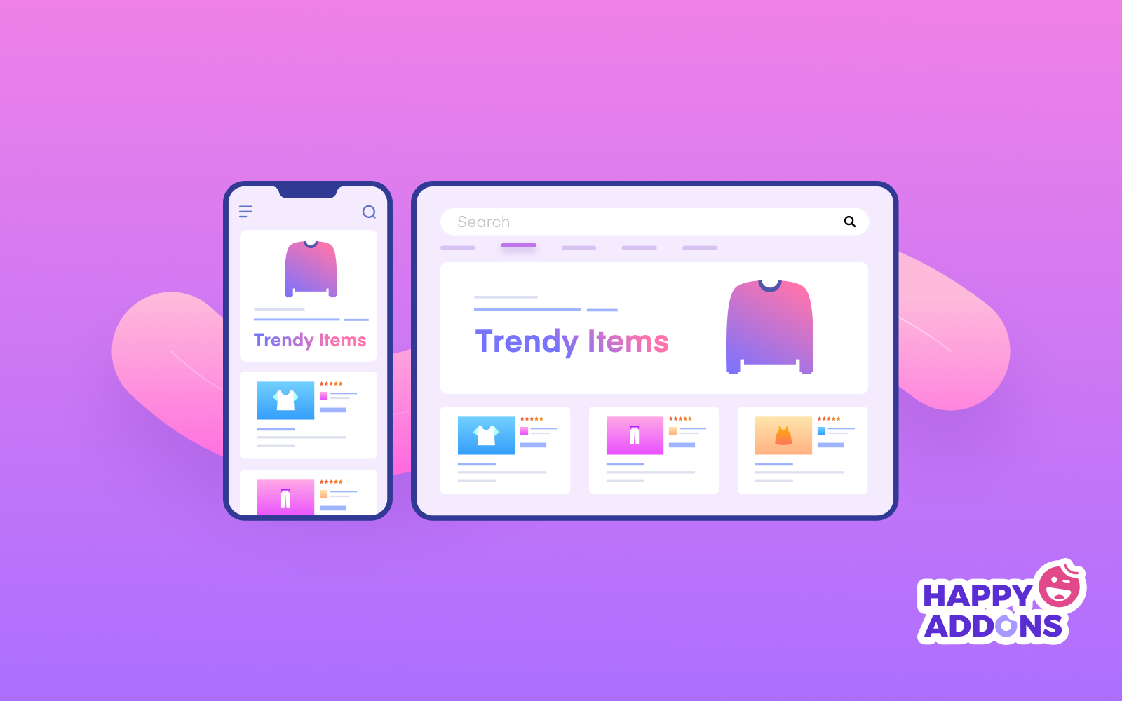
To make your WordPress site more responsive, use a mobile-friendly theme and optimize your images. Implement responsive design techniques and plugins.
A responsive WordPress site ensures a seamless user experience across all devices, which is crucial in today’s mobile-driven world. Mobile-friendly themes automatically adjust the layout to fit various screen sizes. Optimizing images reduces load times, enhancing performance. Plugins like WPtouch can further enhance mobile responsiveness.
By focusing on these elements, you not only improve user experience but also boost your site’s SEO ranking. A responsive design adapts to different devices, making navigation easy and efficient. This approach keeps visitors engaged and reduces bounce rates. Prioritizing responsiveness is essential for modern websites.
Optimize Images
Images can slow down your WordPress site if not optimized. Improving the responsiveness of your site involves making images load quickly. This helps enhance user experience and improve your site’s SEO.
Resize For Speed
Large images can take a long time to load. This can make your site slow. Resizing images can help improve site speed. Use image editing tools to resize your images before uploading.
- Resize images to the exact dimensions needed.
- Keep image dimensions consistent.
- Use appropriate image formats such as JPEG, PNG, or GIF.
Using smaller images reduces the amount of data to be loaded. This results in faster load times and a more responsive site.
Use Compression Tools
Image compression reduces the file size without losing quality. This helps in faster loading times. There are several tools available for this purpose.
| Tool | Description |
|---|---|
| WP Smush | Compresses images without reducing quality. |
| Imagify | Offers three levels of compression. |
| TinyPNG | Compresses PNG and JPEG images efficiently. |
Using these tools ensures your images load quickly. This results in a more responsive WordPress site.
Following these tips will help you optimize your images effectively. This will improve the overall responsiveness of your WordPress site.
Leverage Browser Caching
Making your WordPress site more responsive is crucial. One effective method is to leverage browser caching. This technique can speed up your site by storing static files in the user’s browser.
Set Expiry Dates
Setting expiry dates for cached files helps improve load times. You instruct the browser to keep files for a set period. Here’s how to do it:
- Open your
.htaccessfile. - Add the following code:
    ExpiresActive On
    ExpiresByType image/jpg "access 1 year"
    ExpiresByType image/jpeg "access 1 year"
    ExpiresByType image/gif "access 1 year"
    ExpiresByType image/png "access 1 year"
    ExpiresByType text/css "access 1 month"
    ExpiresByType text/html "access 1 month"
    ExpiresByType application/pdf "access 1 month"
    ExpiresByType text/x-javascript "access 1 month"
    ExpiresByType application/x-shockwave-flash "access 1 month"
This code sets expiry dates for various file types. It tells the browser to store these files for a specified time.
Use Cache Plugins
Cache plugins can simplify the caching process. They automate most of the work for you. Popular options include:
| Plugin | Features |
|---|---|
| W3 Total Cache | Improves SEO, reduces load times, and supports mobile devices. |
| WP Super Cache | Generates static HTML files, easy setup, and CDN support. |
| WP Rocket | User-friendly, lazy load images, and database optimization. |
These plugins offer various features to speed up your site. Choose one based on your needs.
By using browser caching and cache plugins, you make your site faster. This enhances user experience and boosts SEO.
Minimize Http Requests
Minimizing HTTP requests is crucial for making your WordPress site more responsive. HTTP requests are made every time a browser fetches a resource. This includes images, CSS files, and JavaScript. Reducing these requests can speed up your site’s loading time.
Combine Css And Js Files
Combining CSS and JS files is an effective way to minimize HTTP requests. Instead of loading multiple files, you can merge them into one. This reduces the number of requests made to the server.
Here’s how to combine CSS and JS files:
- Open your theme’s folder.
- Find all the CSS files.
- Copy the content of each file into one main CSS file.
- Do the same for JS files.
- Update your theme to use the combined files.
Combining files can drastically reduce load times, making your site more responsive.
Use Lazy Loading
Lazy loading is another technique to reduce HTTP requests. With lazy loading, images and videos load only when they are about to be viewed. This reduces the initial load time of your site.
To implement lazy loading, follow these steps:
- Install a lazy loading plugin like Lazy Load.
- Activate the plugin from your WordPress dashboard.
- Configure the settings to suit your needs.
Lazy loading can significantly improve your site’s performance. It ensures that only necessary resources are loaded initially, making your site faster.
Here’s a simple example of lazy loading for an image:


Using these methods can make your WordPress site more responsive. Reducing HTTP requests is a key step in optimizing your site’s performance.
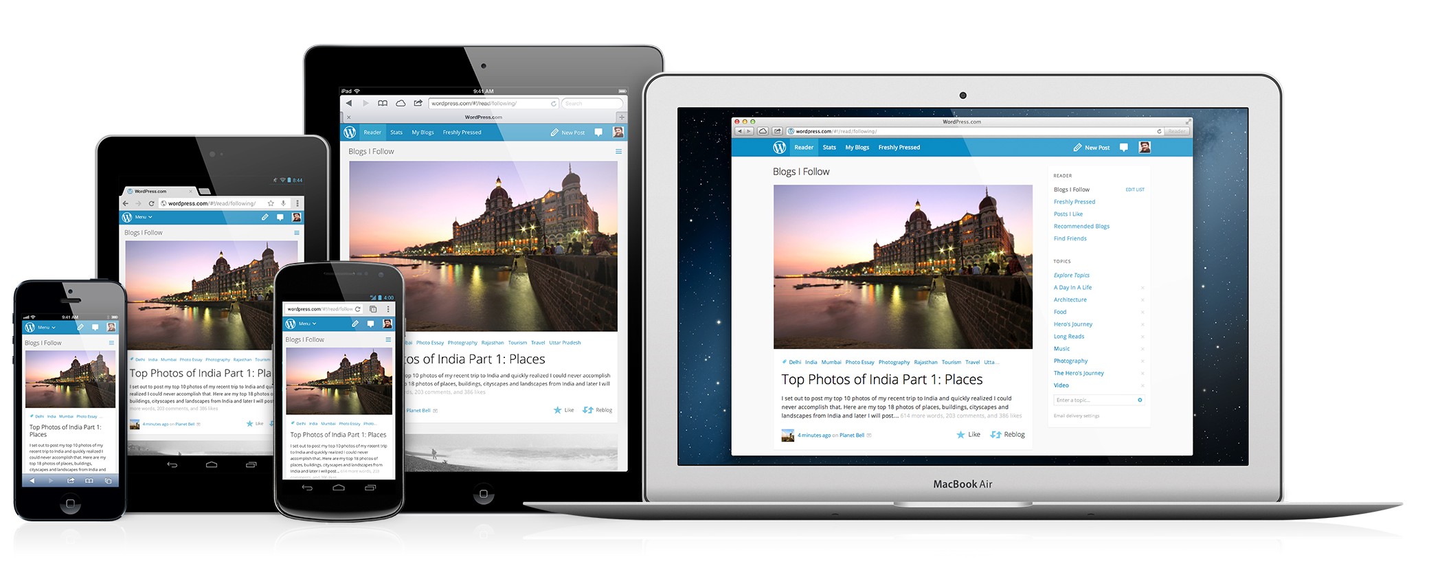
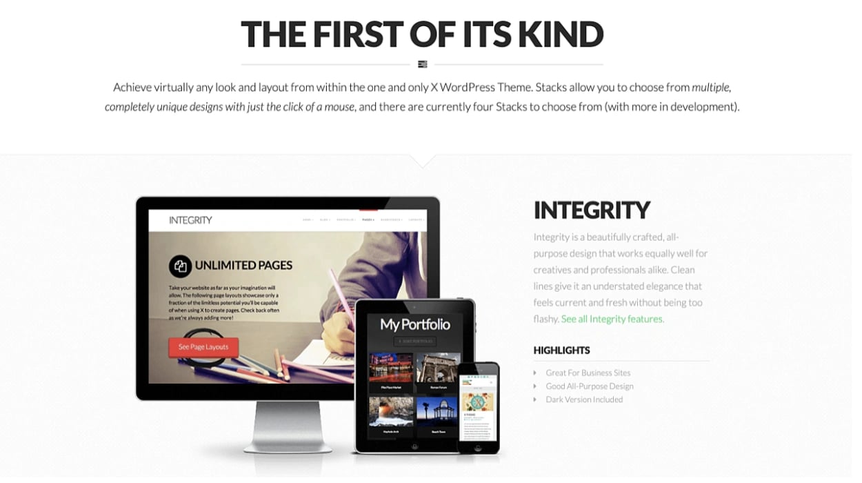
Choose A Responsive Theme
Choosing a responsive theme is the first step to make your WordPress site more responsive. A responsive theme adjusts itself to various screen sizes. This ensures users have a great experience on any device.
Mobile-friendly Designs
Mobile-friendly designs are crucial for a responsive WordPress site. These designs ensure your website looks good on smartphones and tablets. A good mobile-friendly theme will have:
- Flexible images and videos
- Readable fonts on small screens
- Touch-friendly navigation menus
Mobile users should not have to zoom in or scroll horizontally. This enhances their browsing experience and keeps them engaged.
Theme Testing Tools
Before finalizing a theme, use theme testing tools to ensure it’s truly responsive. Here are some popular tools to test your theme:
| Tool | Description |
|---|---|
| Google Mobile-Friendly Test | Checks if your site is mobile-friendly |
| Responsive Design Checker | Previews your site on different devices |
| Browser Developer Tools | Tests responsiveness using browser tools |
Use these tools to identify any issues in your theme. Fixing these issues will make your site more responsive and user-friendly.
Enable Gzip Compression
Making your WordPress site more responsive can greatly improve user experience. One effective method is to enable Gzip compression. This reduces file sizes and speeds up your website’s load time. Here’s how you can do it:
Configure .htaccess
To enable Gzip compression, you can modify the .htaccess file. This file is located in your website’s root directory. Follow these steps:
- Access your site’s root directory via FTP or cPanel.
- Find the
.htaccessfile. - Add the following code to the file:
  # Compress HTML, CSS, JavaScript, Text, XML, and fonts
  AddOutputFilterByType DEFLATE application/javascript
  AddOutputFilterByType DEFLATE application/rss+xml
  AddOutputFilterByType DEFLATE application/vnd.ms-fontobject
  AddOutputFilterByType DEFLATE application/x-font
  AddOutputFilterByType DEFLATE application/x-font-opentype
  AddOutputFilterByType DEFLATE application/x-font-ttf
  AddOutputFilterByType DEFLATE application/x-javascript
  AddOutputFilterByType DEFLATE application/xhtml+xml
  AddOutputFilterByType DEFLATE application/xml
  AddOutputFilterByType DEFLATE font/opentype
  AddOutputFilterByType DEFLATE font/otf
  AddOutputFilterByType DEFLATE font/ttf
  AddOutputFilterByType DEFLATE image/svg+xml
  AddOutputFilterByType DEFLATE image/x-icon
  AddOutputFilterByType DEFLATE text/css
  AddOutputFilterByType DEFLATE text/html
  AddOutputFilterByType DEFLATE text/javascript
  AddOutputFilterByType DEFLATE text/plain
  AddOutputFilterByType DEFLATE text/xml
Save the file and upload it back to your server. This will enable Gzip compression for your website.
Plugin Solutions
If you prefer a simpler method, you can use plugins. Here are some popular options:
- WP Rocket: This premium plugin offers Gzip compression and other features.
- W3 Total Cache: A free plugin that includes Gzip compression settings.
- Autoptimize: Another free plugin that can enable Gzip compression.
To use these plugins, follow these steps:
- Go to your WordPress dashboard.
- Navigate to Plugins > Add New.
- Search for the desired plugin.
- Click Install Now and then Activate.
After activating the plugin, navigate to its settings. Enable Gzip compression from there.
Optimize Database
One critical step to making your WordPress site more responsive is to optimize your database. A cluttered database can slow down your site and affect its performance. Cleaning up and optimizing your database can significantly improve your site’s speed and responsiveness.
Clean Up Revisions
WordPress saves every draft and revision of your posts. Over time, this can bloat your database. Cleaning up these revisions can help.
- Go to your WordPress dashboard.
- Navigate to Tools > Database.
- Select the Revisions option.
- Click on Clean to remove old revisions.
This will free up space and improve your site’s performance.
Use Optimization Plugins
Using optimization plugins can help automate the database cleanup process. These plugins are easy to use and effective.
Here are some popular plugins:
- WP-Optimize: Cleans up unnecessary data and optimizes database tables.
- WP-Sweep: Deletes revisions, auto drafts, and unused terms.
- Advanced Database Cleaner: Removes old revisions, drafts, and more.
Install these plugins from the WordPress plugin repository:
- Go to Plugins > Add New.
- Search for the plugin name.
- Click Install Now and then Activate.
Run these plugins regularly to keep your database optimized.
Implement A Content Delivery Network (cdn)
Implementing a Content Delivery Network (CDN) can greatly enhance your WordPress site’s responsiveness. A CDN stores copies of your site’s files across various global servers. This means users access your site from a server closest to their location. This reduces load times and improves user experience.
Cdn Benefits
Using a CDN offers multiple advantages:
- Faster Load Times: A CDN reduces the distance data travels.
- Improved User Experience: Faster sites keep users happy.
- Increased Site Reliability: CDNs handle traffic spikes better.
- Enhanced Security: Many CDNs offer built-in security features.
- SEO Boost: Faster sites can rank higher on search engines.
Top Cdn Providers
Here are some leading CDN providers:
| Provider | Features | Price |
|---|---|---|
| Cloudflare | Free plan, DDoS protection, global coverage | Free to premium |
| Amazon CloudFront | Customizable, pay-as-you-go, extensive network | Pay-as-you-go |
| KeyCDN | Easy integration, real-time analytics, affordable | Pay-as-you-go |
| StackPath | High performance, built-in security, developer-friendly | Monthly plans |
Choosing the right CDN depends on your site’s needs and budget. Evaluate each option and select the one that best meets your requirements.
Use Responsive Plugins
Making your WordPress site responsive is crucial. It ensures a better user experience across all devices. One effective way to achieve this is by using responsive plugins. These plugins automatically adjust your site’s layout to fit various screen sizes.
Essential Plugins
Several plugins can make your site more responsive. Here are some essential ones:
- WP Touch: This plugin creates a simple mobile theme for your site. It works well with most themes and plugins.
- Jetpack: Known for its many features, Jetpack also offers a mobile theme option. This ensures your site looks good on all devices.
- Responsive Menu: This plugin helps create mobile-friendly menus. It makes navigation easy for mobile users.
Plugin Compatibility
Not all plugins work well together. Before installing a new plugin, check its compatibility. Ensure it works with your current theme and other plugins.
| Plugin | Compatible With |
|---|---|
| WP Touch | Most themes and plugins |
| Jetpack | Popular themes and plugins |
| Responsive Menu | All major themes |
Testing is essential. After installing a plugin, check your site on different devices. This helps identify any issues quickly.
Using responsive plugins can greatly enhance your site’s functionality. They ensure a smooth user experience across all devices.
Frequently Asked Questions
How Can I Make My WordPress Site Mobile-friendly?
To make your WordPress site mobile-friendly, use a responsive theme. Optimize images and enable AMP (Accelerated Mobile Pages). Test the site on various devices to ensure compatibility.
What Are The Best Responsive WordPress Themes?
Some of the best responsive WordPress themes include Astra, OceanWP, and GeneratePress. These themes offer excellent customization options and are mobile-friendly.
How Do Plugins Improve Site Responsiveness?
Plugins like WP Rocket and Smush can optimize your site. They enhance loading times and image optimization, making your site more responsive.
Is A Responsive Design Important For Seo?
Yes, a responsive design is crucial for SEO. Google prioritizes mobile-friendly sites in search rankings, enhancing your site’s visibility and user experience.
Conclusion
Enhancing your WordPress site’s responsiveness boosts user experience and improves search engine rankings. Implement mobile-friendly themes and optimize images. Regularly test your site’s performance on various devices. Follow these steps to ensure a seamless browsing experience for your visitors. Your responsive WordPress site will keep users engaged and satisfied.